
Apple Computer was founded on April 1, 1976. By April 1, 2026, that is fifty years of products, misses, comebacks, and platform gravity. The anniversary is a reasonable moment to talk about discipline rather than nostalgia. The story is often told through objects: Mac, iPod, iPhone, iPad, Watch, Vision, services. The deeper lesson is operating-system thinking applied to product companies.
Reader promise: You will understand Apple as an operating discipline: integration, restraint, defaults, and ecosystem leverage.
Fast Context
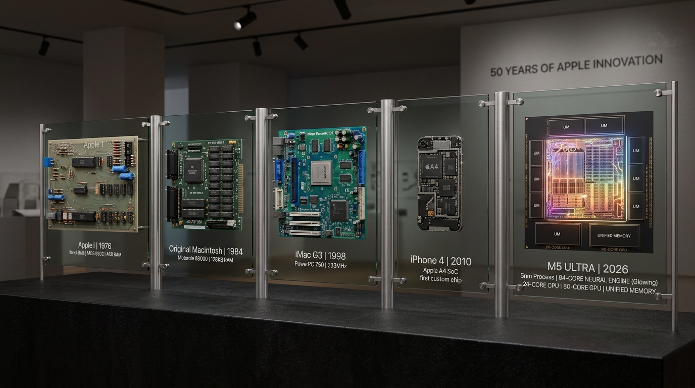
Apple repeatedly wins when hardware, software, interaction design, retail, and ecosystem strategy are treated as one system. It loses clarity when channels multiply without a coherent default, or when polish becomes a substitute for progress. This essay is product craft analysis, not a shareholder note, and not a claim that every Apple decision aged well.
TL;DR
Apple’s advantage is not only taste. It is integration under constraint. The company says no to many options so the user sees fewer seams, fewer decisions, and a more coherent experience. Vertical integration tunes performance, battery, security, and interaction together. Ecosystem continuity makes devices more valuable as a set. The risks are closed interoperability, premium cost structures, and restraint that starts to look like hesitation.
What Shines Across Five Decades
Vertical integration as a systems bet
When silicon, OS, APIs, and industrial design share a roadmap, teams can optimize end-to-end. That is how battery life, thermal behavior, camera pipelines, and security features can feel like one product instead of a kit of parts.
Restraint as UX performance
The best interfaces remove decisions. Defaults that are excellent beat preferences panels that externalize unresolved design arguments onto users. Motion that clarifies state beats motion that celebrates itself.
Ecosystem continuity
Handoff, shared credentials, accessory protocols, and consistent interaction models create compound value. The ethical line is important: continuity should save time, not trap people.
Feature velocity is deliberately lower—Apple’s historical strength is coherent shipping, not winning every race to first. Scores are my judgment.
What I Would Watch
- Interoperability posture. A polished ecosystem can become limiting when openness is treated only as threat.
- Category expansion cost. Premium expectations raise the bar for every new product line.
- Inertia risk. Waiting for certainty can cede habit formation in AI, messaging, or developer tools.
- Services complexity. Recurring revenue is healthy until the account graph becomes a tax on understanding your own devices.
The Workflow I Would Steal for Any Product
1. Start with the user goal, not the technology inventory. 2. Remove nonessential choices from the primary path. 3. Make defaults excellent; hide power-user depth behind progressive disclosure. 4. Use motion only when it communicates state or spatial relationships. 5. Align engineering metrics (latency, battery, crash rate) with experiential metrics (time to task, error recovery). 6. Say no loudly enough that the yes remains sharp.
What "Taste" Means in Engineering Terms
Taste is often mystical in tech writing. I translate it into checkable properties:
- Latency of the happy path feels instantaneous on target hardware
- Error recovery is obvious and non-destructive
- Typography and spacing create hierarchy without shouting
- Sound, haptics, and motion (when present) communicate state
- Defaults match the majority case so settings stay optional
- Naming matches user mental models, not internal org charts
Those are not vibes. They are testable. Teams that only debate aesthetics without measuring the above are doing mood boards, not product discipline.
The AI Era Stress Test
The next decade will test whether Apple-like restraint survives intelligence features. Every company is tempted to bolt a chat panel onto every surface. My read: the Apple-shaped answer is still verbs and outcomes—summarize this, edit that, complete the shortcut—more than a personality that lives in a bubble.
If anniversary lessons mean anything for builders outside Cupertino, it is this: do not let model demos dictate information architecture. Let user goals dictate where intelligence appears, then apply the same integration standards you would apply to battery life or touch latency.
Things I Learned
- The best interface is often the one that removes a decision.
- Product quality compounds through defaults, transitions, typography, materials, and support—not only new SKUs.
- Ecosystem design works when it saves time, not when it traps the user.
- Anniversary narratives should teach operating principles, not only celebrate icons.
- Taste becomes real when it is encoded as measurable product properties and defaults.
How I Would Apply This
For portfolio and product interfaces—including this site’s Apple-inspired design language:
- Reduce visible complexity
- Prefer solid hierarchy over decorative chrome
- Use restrained motion
- Make navigation predictable
- Ensure every card answers a real user question
- Add intelligence as scoped actions, not a second product personality
Bottom Line
Apple’s first fifty years show that technology becomes memorable when engineering and taste point in the same direction. The hard part is keeping that discipline while the platform expands—especially into intelligence features that tempt every product to grow a chat-shaped lump.
Sources and framing
- Company founding date April 1, 1976 is historical fact; "at 50" is used as a product-discipline frame around April 1, 2026.
- Public Apple product history and Human Interface design culture as general references
- Judgments about strategy tradeoffs are my read as a builder, not official Apple narrative